
How to Improve Website Conversions Without Guesswork
A visitor has already done the hard part: they found your business, opened the site and given you a few seconds of attention. If the next step is unclear, slow or unconvincing, that opportunity disappears. Knowing how to improve website conversions is less about adding clever sales tactics and more about removing the friction between a visitor's question and a confident action.
For a local service business, that action may be requesting a quote. For a SaaS product, it might be starting a trial. For an internal tool or browser extension, it could be booking a demo with the people who need it. The page needs to make that one action feel sensible, low effort and worth taking.
Start with the conversion you actually need
A website cannot be optimised properly around a vague goal such as getting more leads. Decide what a valuable conversion looks like and how it supports the business. A completed contact form may be useful, but a booked discovery call from a well-qualified prospect is usually better. An email sign-up may be a sensible first conversion for a longer sales cycle, while a direct purchase makes more sense for a product with a clear price and short decision process.
Choose one primary action for each key page. Supporting actions can still exist, but they should not compete with it. A homepage that asks visitors to call, email, subscribe, browse services, download a brochure and follow social channels at the same time makes every route weaker.
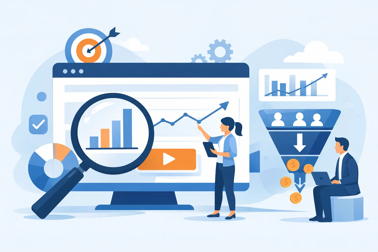
This is also where analytics becomes practical rather than decorative. Track the stages that matter: landing-page visits, calls to action clicked, form starts, form completions and booked calls or purchases. If you only measure total traffic, you cannot see where intent is being lost. A small volume of relevant visitors that converts well is more valuable than a large audience that never gets past the first screen.
How to improve website conversions with a clearer journey
Most low-converting sites make visitors work too hard to understand three things: what the business does, who it is for and what happens next. Put the answer near the top of the page in plain language.
A strong opening section is specific. Rather than saying you provide innovative digital solutions, say what you build and the result it enables. A service business might explain that it designs and develops fast custom websites that generate enquiries. A SaaS provider might state the operational problem it removes, the team it serves and the time it saves.
The main call to action should match the visitor's level of commitment. Asking a first-time visitor to commit to a lengthy consultation can be too much, especially when the service is complex or high value. In that case, a clear invitation to discuss a project, request a tailored quote or see a relevant case study may work better. Conversely, hiding prices and making every customer book a call can create unnecessary resistance for a simple product.
Keep the path from interest to action short. The navigation, page sections and buttons should lead naturally towards the next decision. If someone arrives from a search for website redesign services, do not send them through a generic company story before explaining your approach, examples of work, typical scope and how to get started.
Make credibility visible before it is requested
People rarely enquire because a page has attractive typography alone. They enquire when the offer feels credible and the perceived risk is low. Design creates the conditions for trust, but evidence does the persuading.
Use real proof close to the point where someone is deciding whether to contact you. That could include client feedback, recognisable project outcomes, screenshots, industry experience, before-and-after improvements or a concise explanation of the delivery process. A founder considering a custom portal will be reassured by evidence that you can handle authentication, billing, integrations and launch support, not just produce a polished interface.
Be precise about what is included. Ambiguity can make a service look flexible, but it can also make buyers assume more cost, more meetings and more risk. Explain whether a project covers discovery, UI direction, development, content implementation, integrations, deployment and post-launch support. The right level of detail depends on the audience, but clear boundaries build confidence.
Testimonials work best when they describe a real concern and a concrete result. Generic praise such as great service is pleasant but easy to overlook. A short comment about responsiveness, a cleaner workflow, a successful launch or a site that is easier for customers to use gives prospects something tangible to believe.
Remove technical and form friction
Conversion work is not only a copywriting exercise. A beautiful page that hesitates on a mobile connection, shifts as it loads or fails to submit a form is losing business for entirely avoidable reasons.
Start with the essentials. Images should be sized and compressed sensibly, fonts should not block the page, and third-party scripts should earn their place. Heavy tracking tools, chat widgets, video embeds and visual effects can all affect page speed. They may be useful, but assess them against the value they add. The answer is not always to remove everything. It is to build a page that prioritises the content and action visitors came for.
Mobile deserves separate attention. A desktop layout can look composed while a phone user has to pinch, scroll past oversized sections or hunt for the contact button. Test real pages on a range of phone sizes, not only in a browser preview. Check that buttons are easy to tap, text is readable and forms do not trigger awkward keyboard behaviour.
Forms are a common conversion leak. Ask only for information you will genuinely use at this stage. For an initial project enquiry, name, email, company and a brief outline may be enough. Requiring budget, job title, phone number, preferred platform, deadline and six other fields can feel like work before a conversation has begun.
When more detail is necessary, explain why. A project budget range can help qualify leads, for example, but the wording should make clear that it helps shape an appropriate recommendation rather than exclude people automatically. Give users clear validation messages, confirm successful submission and ensure every enquiry reaches a monitored inbox or CRM. A broken handover is as costly as a broken form.
Test the biggest assumptions first
Good conversion optimisation is structured learning, not changing button colours every fortnight. Begin with a clear question based on evidence. For example: are visitors leaving because the offer is unclear, because the page loads slowly, because the form is too demanding, or because they need more proof before contacting you?
Review analytics alongside behaviour. High traffic with low calls to action clicks often points to a weak message or poor page hierarchy. Strong button clicks but low form completion suggests a problem after the click. If certain traffic sources convert far better than others, look at the expectations set by the ad, search term or campaign before changing the site itself.
Prioritise changes by likely impact. Rewriting a vague headline, adding relevant project proof and simplifying a five-step enquiry path will usually teach you more than minor styling changes. Run one meaningful test at a time where possible, especially on sites with modest traffic. Otherwise, it becomes difficult to know which change influenced the result.
Do not treat conversion rate as the only measure of success. Reducing form fields may increase submissions while lowering lead quality. A more direct pricing page may discourage poor-fit enquiries but improve sales conversations. The best outcome is not maximum clicks. It is more of the right customers moving into a process your business can deliver well.
Build pages around real buying questions
The strongest conversion pages anticipate the questions a prospect would ask on a call: Can you solve my problem? Have you done something comparable? What will the process be like? What does it involve from my side? How quickly can we begin?
Answer those questions with useful detail and a page that feels considered from first load to final form submission. For businesses that need both design quality and technical delivery, that means connecting the visual experience to the practical work behind it: integrations that function, analytics that measure, forms that route correctly and a launch process that does not end when the site goes live.
A better website conversion rate is rarely the result of one dramatic change. It comes from respecting the visitor's time at every stage. Make the offer clear, make the next step easy and give people enough evidence to act with confidence.