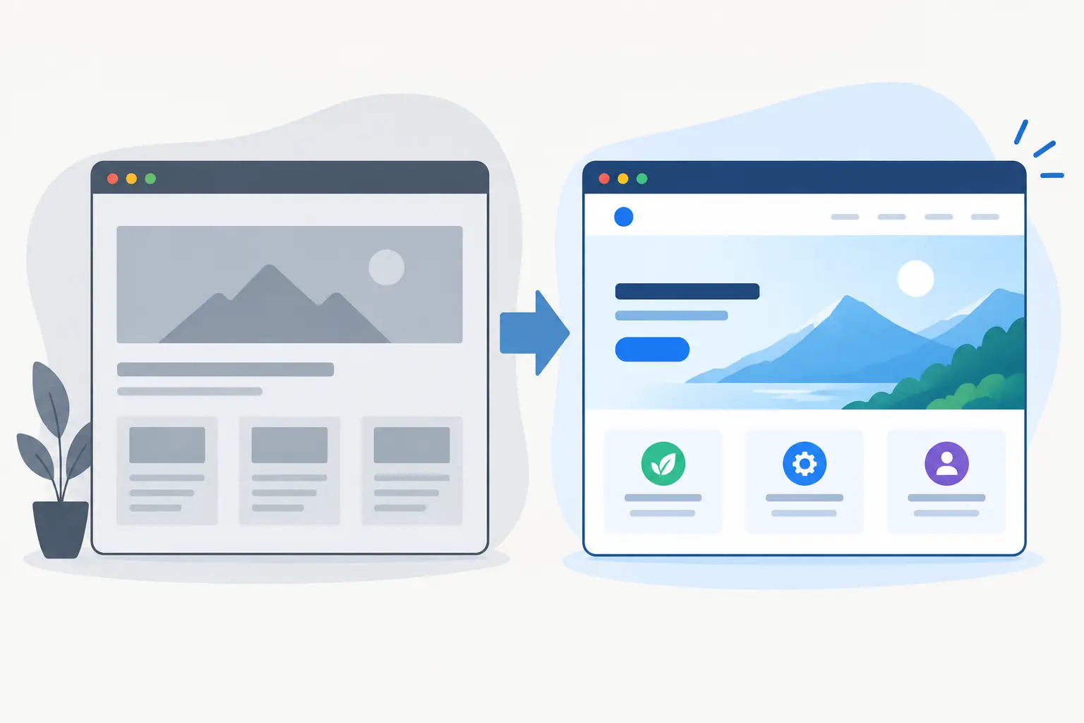
A website redesign before after example is only useful when it explains more than a visual upgrade. A smarter colour palette and sharper photography can make an immediate impression, but they do not automatically create more enquiries, trial sign-ups or sales. The real value is in showing how design, content, performance and technical decisions work together to remove friction for the people you want to reach.
For a service business or SaaS product, a redesign should answer practical questions quickly. What do you offer? Who is it for? Why should someone trust you? What should they do next? If the old site makes visitors work to find those answers, the problem is not simply that it looks dated. It is that the site is failing to support the business.
What a useful before and after example should show
The “before” side should be honest about the operational issue, not a collection of embarrassing screenshots. Perhaps the site was slow on mobile, had no clear call to action, buried key services three clicks deep, or required manual handling after every enquiry. Those are business problems with a web component.
The “after” should show the decisions made to solve them. That might mean restructuring navigation around customer needs, writing clearer service pages, adding case-study proof, compressing media, or connecting forms to a CRM or internal workflow. A good redesign turns a website from a brochure into a dependable part of day-to-day operations.
Visual change still matters. A consistent type scale, deliberate spacing and a clearer visual hierarchy make a business feel more established. But presentation earns attention; usefulness earns action. The strongest projects improve both.
Website redesign before after example: a service business
Consider a fictional Welsh building consultancy that has grown through referrals. Its existing website was built several years ago using a generic theme. It listed every service on the home page, used stock imagery throughout and placed the contact number in the footer. The owner received enquiries, but they were often poor fits and many visitors left without getting in touch.
Before: a site that made customers hunt
The home page opened with a broad statement about quality and experience. It did not say whether the firm worked with homeowners, commercial property managers or developers. A visitor needing a survey had to open a general services page, scan several long paragraphs, then find a separate contact page.
The site also had technical limitations. Large uncompressed images slowed it down on mobile connections. The enquiry form sent a basic email with no indication of the service required, project location or budget range. Updates depended on editing a page-builder layout that was easy to break.
None of this meant the business was poor at its work. In fact, its reputation was strong. The website simply did not communicate that strength or make the next step straightforward.
After: a clearer route to an enquiry
The redesign begins with customer journeys rather than decoration. The new home page makes the core services visible immediately and gives each audience a clear route: residential surveys, commercial consultancy and project support. The opening message describes the outcome customers can expect in plain language, followed by local credibility, selected project evidence and a direct enquiry route.
Each service page answers the questions prospects tend to ask before calling. It explains the type of work, who it suits, what is included and how the process starts. This is not about padding pages for search engines. It reduces uncertainty for genuine buyers and helps filter enquiries that are outside the firm’s scope.
The contact form collects useful information without turning into an application form. A few structured fields - service, location and a short description of the project - give the business enough context to respond properly. The submission can be routed to the right inbox, logged in a CRM or sent to an internal dashboard, depending on how the team works.
On the technical side, images are properly sized, pages are built with a lean component system and analytics events track meaningful actions such as form submissions and phone-number taps. The result is cleaner on screen, faster in use and easier to maintain when services or team members change.
The changes that usually make the difference
A redesign does not need every possible feature. In many cases, the best outcome comes from making a small number of high-impact improvements properly.
First, the site needs a clear hierarchy. Visitors should be able to understand the offer without decoding marketing language. Headings, supporting copy and calls to action should move from the main problem to the next sensible action. If a page has three competing messages and five different buttons, it is unlikely to convert well.
Second, trust needs to appear where decisions happen. Reviews, recognisable clients, project outcomes, accreditations and real team photography can all help, but only if they are relevant and credible. A testimonial hidden on a separate page has less value than a concise quote placed beside the service it supports.
Third, mobile performance deserves the same attention as desktop presentation. Many local and service-led searches begin on a phone, often between other tasks. Oversized assets, intrusive pop-ups and forms that are difficult to complete on a small screen create avoidable drop-off. Fast loading and readable layouts are not technical extras. They protect interest at the moment it exists.
Finally, the website should fit the business workflow. A lead form that creates more admin is not a finished solution. Depending on the operation, a redesign may include calendar booking, quote requests, Stripe payments, customer logins, automated follow-ups or a connection to Google APIs. The right integration is the one that removes repetitive work without making the customer journey harder.
Do not mistake a redesign for a reskin
There is a trade-off here. A visual reskin can be quicker and less expensive when the existing site architecture, content and conversion paths are already sound. If the business only needs a more current brand treatment, that may be the right call.
However, putting a new interface over unclear content or fragile technology usually postpones the real work. The new site may look better in a screenshot while keeping the same slow pages, confusing navigation and manual processes underneath. That is why discovery matters before design starts.
A practical review looks at search performance, analytics, top landing pages, conversion routes, existing content and the systems behind the site. For a SaaS business, this might also include authentication, billing states, product onboarding and support flows. For a local business, it may focus on the services people search for, geographic relevance and how quickly enquiries receive a response.
The answer is not always a full rebuild. Sometimes the right project is a focused landing-page programme, a new information architecture or a performance pass on a site that is otherwise working. The scope should follow the problem, not a fashionable redesign checklist.
How to measure the after
The best “after” result is not a vague claim that the site feels more professional. Set a baseline before launch and measure what matters afterwards. For a lead-generation website, that could be qualified form enquiries, booked calls, phone taps, response time or the percentage of visitors reaching key service pages. For a product business, it may be trial starts, completed onboarding, paid conversions or support requests per active customer.
Numbers need context. A rise in traffic is useful only if the visitors are relevant. More form submissions are not necessarily better if they create a stream of unsuitable enquiries. Look at quality alongside volume, and give the data enough time to settle after launch.
It is also worth planning for iteration. Analytics may show that a useful page is rarely reached, that a form field causes abandonment, or that visitors repeatedly search for information not covered in the navigation. A well-built custom site makes these improvements manageable rather than requiring another redesign every time the business evolves.
A strong redesign should leave you with more than polished screenshots. It should give customers a clearer reason to choose you, give your team a simpler way to handle the next step, and give the business a site that is ready for the work ahead.