
A Website Redesign Conversion Uplift Example
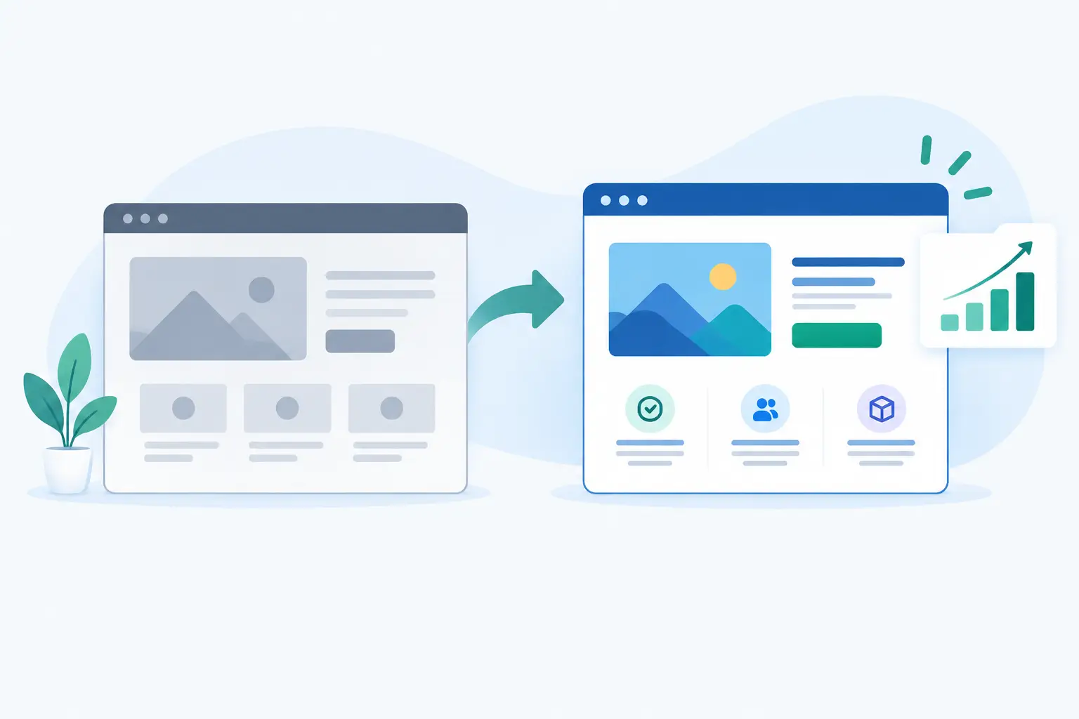
A website redesign conversion uplift example is more useful when it shows the decisions behind the number, not just a polished before-and-after screenshot. A better-looking site can still underperform if visitors cannot quickly understand the offer, find evidence they can trust, or take the next step without friction.
Consider a typical service business: an established UK consultancy generating steady traffic through referrals, Google searches and LinkedIn, but receiving fewer qualified enquiries than expected. Its existing site looked dated on mobile, buried its core services in general copy, and sent every visitor to the same short contact form. The redesign increased completed enquiries from 2.1% to 3.4% over the following eight weeks - a conversion uplift of roughly 62%.
That result did not come from changing a button from blue to green. It came from rebuilding the journey around how prospective clients actually make a decision.
The starting point: traffic was not the problem
Before redesigning anything, the business reviewed its analytics, enquiry records and sales calls. Monthly traffic sat at around 4,800 sessions, with healthy interest in several high-value service pages. The issue was what happened after visitors arrived.
Mobile users accounted for nearly two-thirds of sessions, yet the old pages loaded slowly and began with large banner images that pushed the useful information below the fold. Service descriptions focused on the company rather than the customer’s problem. Case studies were difficult to find, and the contact page asked for too much information before explaining what would happen next.
The team also found a mismatch between leads and revenue. Some pages generated form completions, but many came from people looking for low-cost, unsuitable work. That meant success could not be measured only by raw enquiry volume. The redesigned site needed to increase conversion rate while helping the right prospects qualify themselves.
Website redesign conversion uplift example: what changed
The redesign began with the commercial proposition, not the visual system. The business had three main services, each with a different buyer, buying cycle and starting budget. Instead of placing them under one broad "What we do" page, each service received its own focused landing page.
The new page structure answered practical questions in the order a buyer needed them answered. First came the outcome and the type of client the service was for. Then the page explained the process, showed relevant work, addressed common objections and presented a clear route to enquire. It sounds obvious, but this ordering matters. A visitor should not have to search through a biography or a wall of generic claims to establish whether a supplier is right for them.
Clearer page messaging
The old headline read like many service-site headlines: broad, positive and interchangeable with competitors. The replacement named a specific result and audience. Supporting copy made the scope clearer, including the types of projects accepted and the expected delivery approach.
This reduced ambiguity. Some visitors were less likely to enquire, but those who did were better matched. For a business with limited time, that is often more valuable than maximising every possible form submission.
A better route from interest to action
The original website used one generic "Contact us" call to action throughout. On the redesigned service pages, the call to action reflected the decision being made: request a project quote, discuss a new build, or arrange a short discovery call.
The form was also shortened. It collected the essentials - name, contact details, service needed, approximate budget and a project outline - then made expectations explicit. Prospects were told when they could expect a reply and what the first conversation would cover.
That change did more than reduce fields. It made the enquiry feel like the start of a considered process rather than a message sent into a void.
Proof placed where doubts appeared
Testimonials and project examples existed on the old site, but they lived on separate pages that few visitors reached. The redesign placed relevant proof beside the claims it supported. A visitor reading about a website rebuild saw an example of a similar project. Someone considering a custom system saw evidence of delivery capability, integrations and ongoing support.
For a freelancer or small studio, proof needs to do several jobs at once. It should show quality, reassure buyers that the work has been delivered before, and demonstrate that there is a reliable person accountable for the outcome. Specificity is more convincing than vague praise.
Faster, more dependable mobile performance
Visual design and front-end performance were treated as part of conversion work, not separate jobs. Large media assets were optimised, unnecessary scripts were removed, and critical page content was prioritised. The navigation was simplified for thumb-friendly use, while the enquiry action remained visible without becoming intrusive.
Page speed will not fix unclear positioning. Equally, excellent copy cannot fully compensate for a page that hesitates to load on a weak mobile connection. The value comes from handling both.
How the uplift was measured
The business compared an eight-week period after launch with an equivalent eight-week period before the redesign. It excluded a short period affected by a paid campaign and checked that traffic source mix had not changed dramatically.
The primary conversion was a completed, valid enquiry. A secondary conversion was a booked call. The team also tracked engagement on key service pages, mobile form completion and the percentage of enquiries that reached proposal stage.
The figures looked like this:
- Valid enquiry conversion increased from 2.1% to 3.4%.
- Booked calls increased from 31 to 52 across the comparison period.
- Mobile form abandonment fell by 28%.
- The proportion of enquiries progressing to a proposal improved from 38% to 49%.
The 62% uplift is useful, but the proposal-stage figure tells the more commercial story. Better messaging and clearer scope filtered out poor-fit work before it reached the inbox.
Why a redesign does not always create an uplift
A redesign can produce a lower conversion rate and still be the right decision. If the previous site attracted irrelevant enquiries because it promised too much or hid pricing expectations, a more focused site may reduce lead volume while increasing revenue potential.
Results also depend on traffic quality. Rebuilding a website will not create demand where there is little search interest, fix an uncompetitive offer, or compensate for slow sales follow-up. If a business takes five days to respond to a quote request, the best form design in the world has limited room to help.
Seasonality matters too. A redesign for a holiday business should not compare July with November and claim the difference as design-led growth. Where traffic volumes are low, use longer measurement periods and combine analytics with qualitative evidence from calls, customer feedback and session recordings.
What to plan before a website redesign
A conversion-led redesign needs more than a brief that says the current site feels old. Start by identifying the pages that bring in valuable traffic, the actions that matter commercially and the objections stopping people from taking them.
Review existing analytics, but do not let dashboards become the whole strategy. Speak to the people handling enquiries. They know which questions recur, what good clients mention before buying and where expectations tend to go wrong. Those insights should shape the page hierarchy, copy and form logic.
It also helps to define the technical requirements early. A small marketing site may need reliable analytics, a lightweight CMS and a well-configured enquiry flow. A more involved operation may need CRM routing, calendar booking, Stripe payments, gated customer areas or automation through external APIs. Designing the interface without planning these connections can create avoidable rework later.
For businesses that need both the front-end experience and the delivery plumbing handled properly, an end-to-end partner such as Zak Furness can take the work from page strategy and UI direction through development, integrations, testing and go-live support.
Build for the next decision, not the launch date
The best website redesigns are not treated as a one-off reveal. Once the new site is live, review the enquiry flow, check where visitors leave, and compare the quality of leads against the original baseline. Small changes to service-page wording, proof placement or form prompts can be tested without rebuilding the entire site.
A credible uplift comes from making it easier for the right customer to recognise themselves, trust the offer and act with confidence. That is a far stronger target than simply making the homepage look newer.